Incraftables
Brand Refresh, Packaging Design, Art Direction, Illustration, Site Design
The Incraftables team came to me needing a new website, and hoping for a slight refresh of their current branding. After learning more about their goals in the crafting community—creating products that are designed in the US, and a fun + trusted brand for families—we ended up collaborating on a much larger brand overhaul. Aiming to compete with other well-known independent craft brands—and get on the shelves of major retailers—we were all in on leveling up Incraftables' current look to match their ambitions. After establishing the refreshed look + feel, our goal was to carry out the vibrant, modern, fun, and friendly energy of the identity to every aspect of the brand. Ultimately, we ended up with a playful, recognizable brand identity that successfully caught the eye of multiple large retailers, sending Incraftables into a new trajectory in their family-owned business. Collaborators : Snapgraphy (Photography)
Color Palette
We infused Incraftables' exisiting color palette with a lot of energy + saturation, while steering clear of any neon tones or shades that felt too elementary. The updated branding straddles the line of appealing to kids (bright + fun), while also appealing to parents (design-focused and modern). We landed on an elevated rainbow spectrum as the final palette, with tones that could easily pair for packaging and other collateral. Typography
Giving the new Incraftables brand a type system that felt modern and universal—especially for product labels and packaging—was a top priority in the branding process. We landed on a slab-serif, handwritten sans, and legible sans to bring a more polished look to the identity without losing some playfulness. We also chose to use lowercase type for product packaging, the site, and other collateral to bring a subtle approachability and friendliness to the branding.Icons
With a large variety of product categories in their inventory, we chose to create a small icon library to help differentiate between products on packaging and the Incraftables site. Creating a design system that was accessible to customers of all ages (via iconography and color-coding) was a huge goal in all materials we designed for the updated brand. Packaging
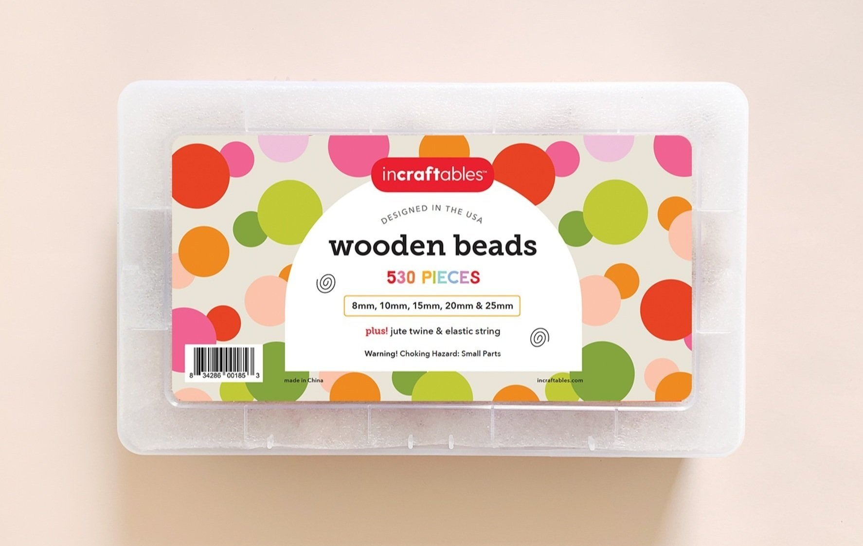
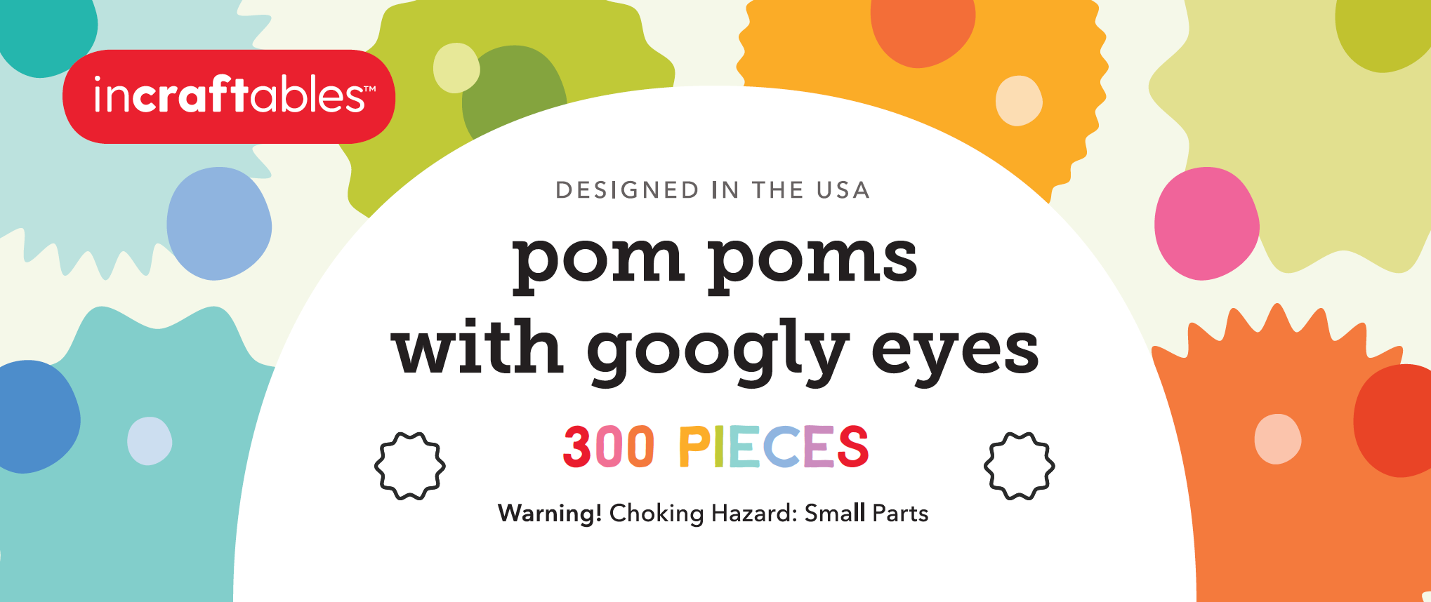
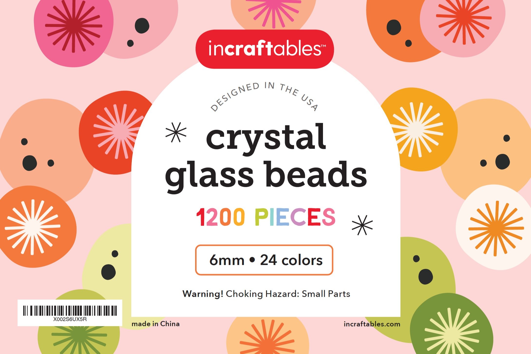
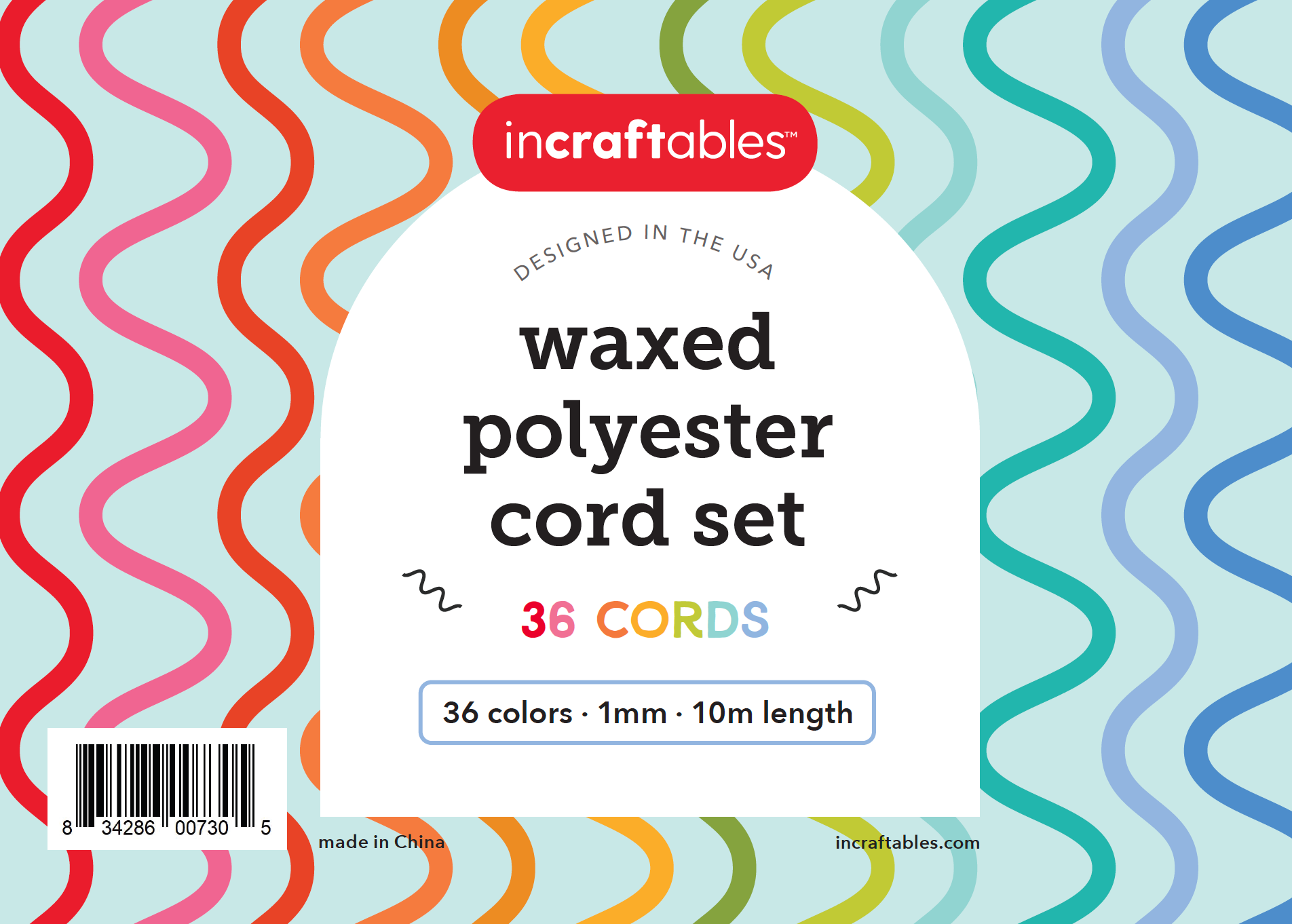
Updating the full packaging suite for Incraftables was the biggest undertaking we worked on in our design process. With existing labels that were mostly white with light patterns, we wanted to make a splash with tons of color, original patterns based on the products, and a labeling system that was recognizable, clear, and flexible. A major goal was to create packaging that would stand out on the shelves, be broadly appealing, and help establish Incraftables' products as collectible items for customers. Website
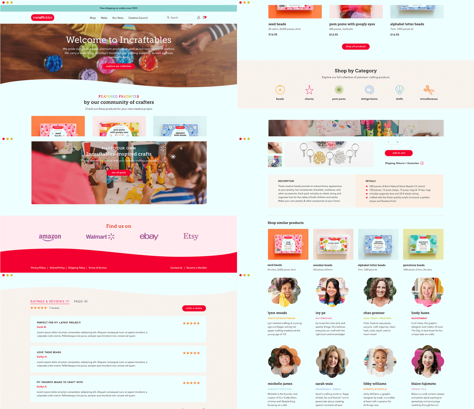
With a sizable e-commerce business already established, Incraftables wanted an expanded site to make their growing product list accessible and introduce new customers (and retailers) to their misson. We saw this as a great opportunity to bring everything together and create a digital space for parents and kids to get excited about. With new tools to make shopping easier and more organized (via categorization, color-coding, search and filtering), sales increased almost immediately. Adding in pieces of the brand story, a creative council directory, and craft blog helped establish brand trust and foster connections with new customers as well. Digital Marketing
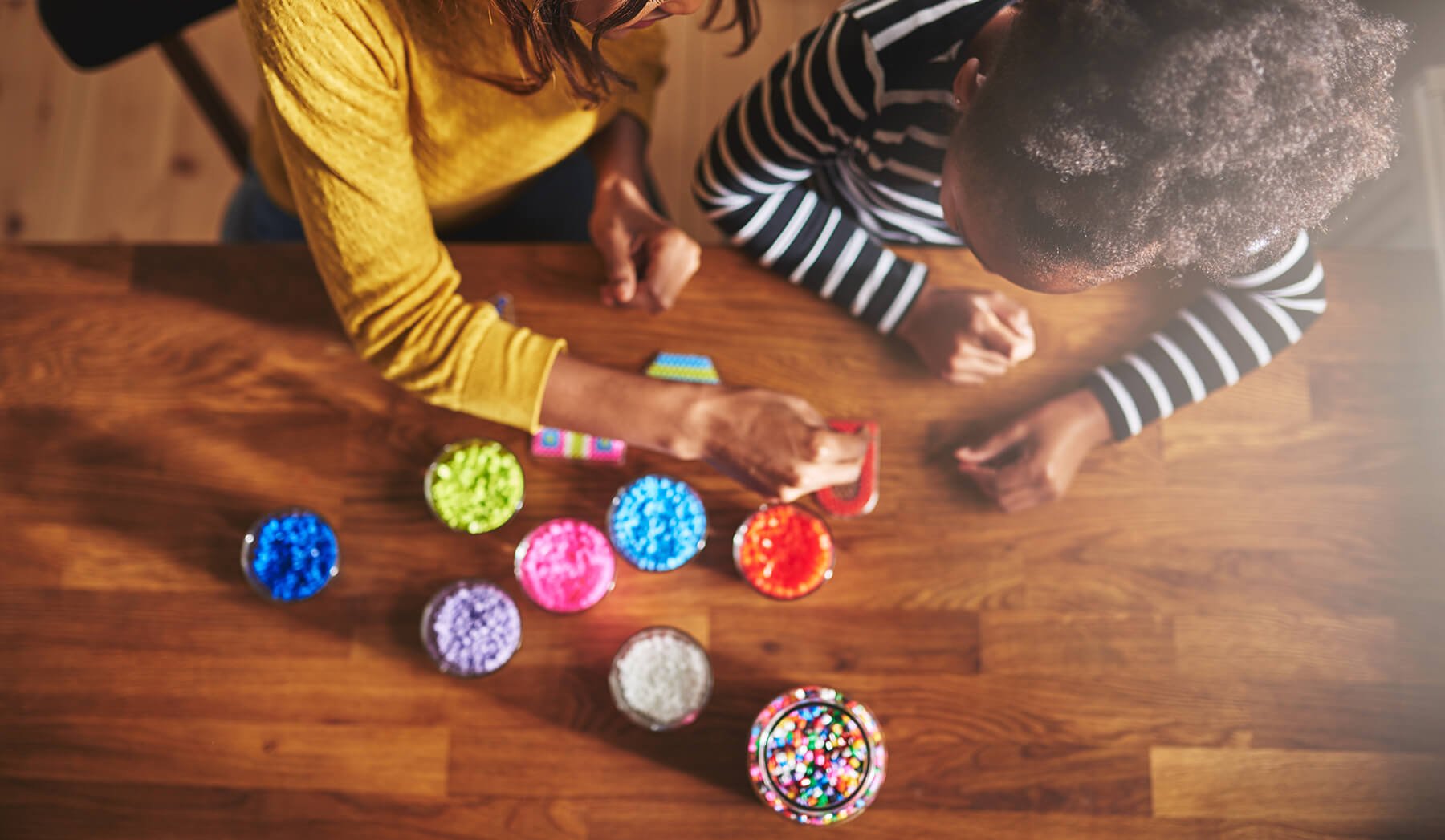
We also created a series of digital assets to support Incraftables' e-commerce sales with their retail partners. All assets feature either custom illustrations or brand photography* and the updated brand colors, typography, patterns and iconography. *All brand photography is done by Snapgraphy


